Showing posts with label comparison. Show all posts

Sunday, January 16, 2011

Chanel Black Pearl...Ho Hum

I swatched the mighty lemming last night at Nordstroms and left it there after comparing it to real black pearls in the jewelry department.  I love black pearls and so I was excited to see if it was worth the hype.

I have to say, for me, it isn't. But then I really wanted it to look like a black pearl on my nails. In my opinion, this color is too green. That would be ok, but there should be some brown duochrome in there to make it work like a real pearl.

I realize that the black pearl comes in many tones, from gray to brown to green and even almost silver, but they all have a duochrome that is, sadly lacking in this polish.

So today, while trying to cram all the new polish in with my existing stash, I rooted through the stash to find comparable shades that might make my fussy ass happy!  I found it in Misa's "It's You!"  It's got the right balance of green/brown duochrome with just a little too much sparkle to completely pull it off but, I can keep my 25 bucks and have the color I want don my nails anytime I want it to. :)

That makes me happy!

Here are a few comparison shots: Thumb is always Chanel Black Pearl. (I realize my cuticles look like hell, just look at the pretty colors!) But first, let's begin with a few pictures of some ACTUAL Black Pearls:


With Gosh Purple Heart (too much like Nubar Peacock Feathers and Borghese Stellar Notte ie: too much purple)


With Nubar Moon Shadow (thought the brown might work, but nope, it shows up very purple too.)


Sally Hansen Prisms Emerald Amethyst is actually very close, just reversed, but I can live with that.


And with Misa "It's You!"  is an almost perfect dupe only better! It shows the duochrome better in the shade, the sunlight brings out the shimmer and it's a bit more sparkly than the Chanel and/or a real Black Pearl. This one actually has the green in the middle with the purple around the edges. It's gorgeous!


I also compared it to the new Estee Lauder Wild Storm, very similar, but WS is more silver...still, I think I see a trend here. :)


And since I swapped my untried Lippmann Hit Me With Your Best Shot, I had to swatch that (I'll replace it with my Apothica gift cert won from Evil Angel) Love this color so much!


This is what my hands looked like after all the swatching. :) And again, please ignore the horrible condition of my cuticles. I've been doing a bunch of house cleaning and it's time for a deep moisture treatment. That week in Las Vegas was hard on my skin!


Why yes, that IS Lippmann Marquee Moon...which shall be mine one day. I love it, it's so different! The sparkles is me comparing Lippmann Happy Birthday with Milani Gems. I know they're not exact, but they're similar enough I can live without HB.

All in All, this Lizard gives Chanel Black Pearl a rating of Chilly. I'd say Tepid, but for the price...it's definitely chilly!

Which color do you like best or do you have an even better "Black Pearl" color? Tell me about it please!

Tuesday, June 29, 2010

Culling Continues with Corals

These are, according to my notes, the Light Corals. The players are, in order of appearance from left to right: Zoya Calypso, Essie Shindig and Zoya Cassi.
In natural light, no flash pic this time. and below on my nails in the same order, left to right in shade...a little too much shade for Cassi, but still you can see her color.
One more shady pic to try to let Cassi show her shady side...(I really dislike the uneven length of my nails here.)
And below in the sun: Ka-POW says Calypso!
All were 3 coats to this coverage.

The Zoyas were both a bit thin and watery but easy to control while the Essie formula was buttery and it also had a fuller brush.

Zoya Calypso is a very pretty orange/coral base with multi colored shimmer. This one is VERY pretty and I am fond of Orange so it's a favorite. Lizard Rating: Toasty!
Essie Shindig is soooo pretty in the bottle. I love just looking at the bottle and swirling it around. It also has a multi colored shimmer but the base has more pink (truer coral) and not as much shimmer as Calypso. Lizard rating: Balmy
Zoya Cassi is a soft coral with a gold shimmer, nice but it loses to Calypso for me. Lizard rating: Tepid

I think all three are still in my stash, but after taking a second look and doing this comparison, I'm thinking I can let go of Cassi.
What do you think? Which one or two would you keep...or would you keep all three? And if so, why?

Monday, June 28, 2010

Some More Reds compared

These are bit deeper and richer than the last set. I like a true red, and a blue-red sets my heart afire. I find them very hard to resist. Here are a couple of each...(and, Yes I do have the Nubar Reds!)
The contenders:
Essie Fishnet Stockings, Miss Marion Mamey, Essie A-List and OPI Xmas 2009 red with no name. Help is welcome. Natural daylight (but indoors). And below is with flash.
As you can see even with the flash, Essie Fishnet Stockings is the bluest-red and I think I love it. Did I mention it's also a jelly?
In the same order on my nails: Fishnet Stockings, Mamey, A-List and OPI in the shade and below is in sunlight.

HAHAHAH! I just found my notebook and I have ZERO notes on these except what I've already noted above. I checked and they are ALL still in my stash...I guess I love them all and can't let them go. I do love a red jelly. Still, I have to let a couple go...I think it's going to be A-list and the OPI. I love Fishnet Stockings and Miss Marion holds a special place in my heart...

The Lizard Rates these like so:
Fishnet Stockings: Toasty
Mamey: Toasty
A-List: Toasty
OPI: Tepid

Which ones did you like best?

Stay tuned, next up I think will be the corals.


Friday, June 18, 2010

Iridescent Pink/Purple Comparison

I thought I would do duochrome purples next but I changed my mind. Those, aka "peacocks" will come later, since I already compared two of them before.

Today I will show you the Iridescent Pink/Purples that were in my stash:
They are: A no name Sephora mini, Sinful Let Me Go and Sally Girl It's So You. 

Here they are on the nail in the above order and in the shade (mostly 3 coats each):

And in full sunlight:

I'm keeping the Sephora mini. I suppose the Sinful would be pretty for layering, but I wanted the bottle color. Maybe it needs to be applied over a similar pink creme? Any suggestions? Oh it doesn't matter, it's already left the stash. :)

But to give you a bit more information on them: 
Sephora no name mini:  The brush was wide for a mini, but I liked the formula and it's got the best pigmentation. It had the pigmentation I WANTED the Sinful to have. Lizard rating: Balmy

Sinful Let Me Go: No problem there, you're gone! Hehehee!  This was a watery, bubbly 4 coat mess. It's really similar to the Sally Girl one, but even the Sally Girl had better pigmentation. Lizard rates this one Chilly...actually, how about Arctic. LOL

Sally Girl It's So You: Ok, you can have it then! (Just kidding)  The formula on this one was really nice, the brush is ok for a mini, actually, I am impressed by the brushes and handles on these little gals. :)  Lizard rating: Tepid. This one might be good for layering, but I'm done deluding myself with the idea of keeping minis in my stash to keep my stash small. This one goes too.

So I'm keeping only the Sephora Mini, it is the only one in the group that gets to bottle color. The other ones don't even come close. I have had the Sephora for a while now and have checked the display every time I go to Sephora and I never see it there anymore...so I apologize now for creating any lemmings that won't ever be fulfilled.  


Monday, May 17, 2010

Burgundy Comparison

The clearing of my inventory continues. This week I'll post more of the comparisons I did, and interject those with some other fun stuffs...like pictures and review of RBL Diddy Mow which I put on today and will test the "9 day wear" claim made there.

On to the comparisons.  Here are the bottles:
Left to right, the players are: Nubar Chocolate Raspberry, Borghese no name mini from Christmas set, Diamond Cosmetics Cherry Tobacco, Sally Hansen mini from Christmas set and OPI mini All A-bordeau the Sleigh.

Same order, starting with my thumb then to my index finger left to right in the sun.
And indoors, indirect daylight.

Nubar Raspberry Truffle is a brown based creme with burgundy flecks. I love the Nubar formula and the brush is good. Two coats to full coverage, but a third adds depth and is so devine. I love this color, it's yummy and has depth to it so it gets to remain in my collection. Lizard rating: Toasty!

Borghese Unnamed mini has an exceptional brush for a mini polish. I found it very easy to use, pro wide and not super short like some minis. They also have a great formula and the pigment was impressive. This is only two coats. Lizard Rating: Balmy only because it is a mini and I'm over minis. LOL

Diamond Cosmetics Cherry Tobacco is a favorite after seeing it on all the other blogs and before this, an untried.  A gorgeous red-brown base with shimmer. Yum! This was as delightful as you've seen out in the blogosphere. The brush is ample, if rather standard. The formula was nice and very well pigmented, also 2 coats to this beautiful finish.

Sally Hansen unnamed mini. This one was also 2 coats of YUM. A rich, dark wine with shine to spare. This brush was also amazing for a mini polish. I loved this color but recently decided that my space won't allow as many bottles as I'd like to own and therefore I'm going to purge Drug Store polishes that I can dupe with a higher end polish. Besides, it's a mini...I'm over 'em. :)  Lizard Rating: Toasty, but no doubt can find a dupe I'll want to keep.

OPI All a-Bordeau the Sleigh was just "meh" for me. Cuticle drag, streaky and the typical issues I have with OPI. I am so not a fan of OPI...has to be a spectacular color that I absolutely cannot get elsewhere before I even consider going there, and usually skip it anyway. This is a not-so-deep red wine. Lizard Rating: Tepid
Maybe a fourth coat would have made this one better but 3 is my limit. Besides, it's a mini...it's gone. :)

I hope you enjoyed my Burgundy Comparison! Next up: Duochrome Purples.

Saturday, May 8, 2010

Thinking about what Beauty means to me...and a Red Comparison (long, but good post!)

While recovering from knee surgery, I took the time to read a ton of books. Some fiction series follow ups that I love and a few books of the "self-help" genre. A friend told me about a book she was reading so I checked out the prologue on Amazon.com and knew I needed to read it. Why? I've been dieting and beating myself up for most of my life and so I could relate to this book. 

I'm sharing this now because I was moved (as many of you were) by Andrea's Post over at Black nail polish and lip gloss and have been wanting to share this book with the world since I got so much out of it. I know that not everyone will, but when I find a gem like this, I usually end up telling everyone I know to CHECK IT OUT CUZ IT'S THE BEST THING SINCE SLICED BREAD!!! Yeah, that's me...and that's ok. :)

It took me the whole week to read the book not because it is a big book, but because I kept having to set it down to think, absorb, cry, thrash, get angry and, finally, accept. I realized that I had, once again, forgotten who I am and gone back to believing what other people's stories told me I am. I also came to realize that I was trying to fill my non-stuff compiling life up with stuff again to counter the difficult financial times the husband and I have been facing. I mean, if I have all this nail polish, then we aren't struggling so bad, right??? RIGHT???

What I learned mostly was to be present again. Be passionate about life and most of all, remember that I am beautiful just as I am right now, and now and now. 

First thing I did was to cancel my Weight Watchers membership. Yep, I've had great success (you'll find this very post over there if you click but there are a couple years of posts and a huge transformation over there if you're interested in learning more about who I am) and some backsliding with that plan but, I learned so much there and because of the time I spent learning their "Tools for Success" I was ready to hear the message in this book.  

I'm done dieting. I'm done telling myself I don't measure up to someone else's idea of what is beautiful. I'm also done eating absently and not enjoying every minute, including the minutes I spend feeding this glorious body I've been blessed with to walk on this beautiful planet I get to call "home."  

And when I hear that little nagging voice, the one that tells me I am not enough, I don't have enough, I'll never BE enough...I will, as soon as I realize I am buying it's bs, tell it to shut the hell up!  It has been a little over a week. ONE WEEK and without counting calories, points, or carbs, without weighing and measuring, without denying myself what my body wants, I'm getting healthier. I've lost 9 pounds. NINE. Just by being present when I eat. I share that because, as the author, Geneen Roth says, "It's not about the weight and yet, it's not NOT about the weight" For some of us, healthier means losing weight, for others, it means gaining or maintaining while nourishing our bodies. For me, it means some weight needs to leave my body...and I will never, EVER diet again. I'm free. I'm back to being me and that is a very cool thing.

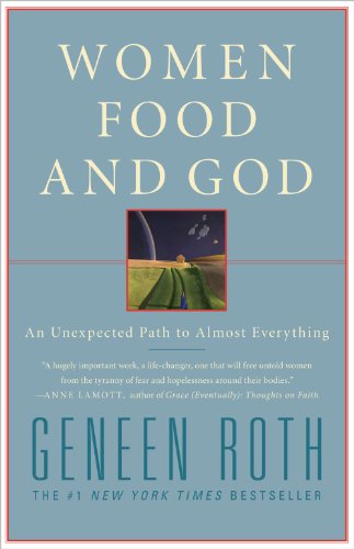
What is this book? If you clicked the Amazon link above, you already know, but if you didn't, the book is 
Women, Food and God: An unexpected path to almost everything.  

So the changes to my attitude lead me to look at my stash and decide it was time to do some culling. I don't need all these bottles taking up space in my tiny home and already increased the size of my stash to at least 20 times my initial plan. Part of that is seeing all these gorgeous colors all you ladies are posting. I love so many of the colors, but I don't NEED them. Hence my asking how you'd feel about some used polish giveaways. I don't want to replace them with swaps...I want to reduce my stash and have the colors I love and only those colors. I want to travel light while I'm here. I forgot that about me... That's not to say I don't envy you all your helmers...it's just not something I want as much as I want to travel light. 

I began the culling with comparisons, which I shall share with you, to help me decide which polishes I want to keep and those that, while still quite nice, are so similar to what I'm keeping, I don't need them in my stash.  I know already, from reading other blogs, that all of my comparisons may show my lack of understanding of dupes and all that stuff, but for me, really, how many red nail polishes do I need? Certainly not 40...more like 4.

I give you the contenders and I think these are Jellies, but there may be a creme in here.
Left to right: Cheeky Monkey Pop My Cherry, Zoya Harley, Miss Marion Carnival, Essie Lollipop, tictac unnamed red

On the nails in the Sun: (all are 3 coats, no base, no top)
Beginning with the Thumb they are in the same order: Thumb = Cheeky Monkey, Forefinger = Zoya, Middle = Miss Marion, Ring = Essie and Pinky = tictac.

In the Shade:

Cheeky Monkey Pop My Cherry is a wonderful true red jelly with a formula I had to learn to use and am now quite fond of. I don't have any complaints about the color, the formula or the brush. The brush is average but the formula would work if all you had to paint your entire nail was a toothbrush. :) Lizard rates this one: Sizzling!

Zoya Harley wasn't a true red, a bit more orange and I thought the formula was a bit on the watery side. Lizard rates this one: Balmy, but I have enough reds so it's downgraded to Chilly because of the formula and it just can't compete with CMPMC.

Miss Marion Carnival is one I really liked when I did my Miss Marion review...I still really like it. The formula is great, the brush is really nice and it builds the color really well. This one was the most orange red of the bunch and that, plus my love for this company makes it rather special to me. It's an orange red I can wear and look at that shine. The Lizard rates this one: Toasty.  It stays

Essie Lollipop: This is a bright red jelly with a delightful formula but the brush is scrawny. In fact, I didn't much like the brush in this one at all. It's very similar, maybe even a complete dupe for Cheeky Monkey Pop My Cherry, but I had to choose the Monkey over this because the brush was challenging and I simply love Cheeky Monkey. Still, the Lizard rates this one: Sizzling! (it's Essie after all.)

tictac unnamed red: This one was a bit of a surprise. I won this in a giveaway and I wasn't expecting very much since it's a brand I'd never heard of nor seen until just before the giveaway.  This was the wateriest polish in the bunch. Cuticle flooding and all. That might be because I am getting used to Cheeky Monkey and Essie but still, this was one watery polish!  It dried super shiny though not as shiny as the others. I think with practice and some topcoat, I might be able to make this one shine. Still, it's not a favorite so it goes in the cull pile. Final Lizard rating: Tepid

Bottle picture with Flash:


In the end, I am keeping only Cheeky Monkey Pop My Cherry and Miss Marion Carnival with a wandering eye on Essie Lollipop as it sits in the cull pile along with Zoya Harley and tictac unnamed red.

Some of these were review samples, some were giveaway winnings...I honestly didn't purchase a single one. Still, it is harder to let them go than I thought it would be.  How will I do it?  A few different ways actually. I'll be having another nail polishing party with my co-workers and friends and I'll take an assortment there for them to choose a few to take home, some will be in various giveaways and if I can make enough room, I may swap and do the Zoya exchange for truly unique to my collection colors. 

I hope you enjoyed my comparison and review of the red jellies I have! Next up: The Darker Reds
Til then, be present, be loving, be true to who you are!
~The Lizard

Wednesday, April 7, 2010

Purple Holo Comparison

I did this comparison back when I did the Silver holo comparison, but it took me a while to learn more about The Gimp so I could get these pictures together for you. It's been a fun time (really) learning how to use this open source program!

On to the polish. I wanted to compare Milani Hi-Res, China Glaze IDK and LOL (both from the OMG collection), and Color Club's Wild at Heart.

I started with Hi-Res on my pinkie:
IDK went on the Ring Finger (I have no idea what that wrinkle on the tip is about):
Wild at Heart on the Middle Finger (with matte top coat on the tip = Fail)
LOL on the Index Finger (again with Matte tip = less fail but still fail):
And then I did the layering of IDK with Hi-Res over the top:
When you look at the Thumb next to the pinkie - Just like the Silver Holo comparison, the rainbow is more pronounced in the layering and the sparkle of Hi-Res adds interest.:
And again I applied matte topcoat to half the thumb and it basically lost all it's holo-y goodness, but I had to try. Since I did this at the same time as the Silver holos, I hadn't learned NOT to matte a Holo. Here's the full line up:

Wild at Heart and LOL are very much the same color with Wild at Heart having a chunkier look, not quite as chunky as Hi-Res, but chunkier than the smoothness of LOL and IDK. Wild at Heart seems to have a bit more purple to it, but they are very similar. All of these colors, like holos do, dried in record time so I had to work quickly to apply them smoothly. 
I love them all and I'm glad I have every single one!
Til next time!
~The Lizard 
Related Posts Plugin for WordPress, Blogger...